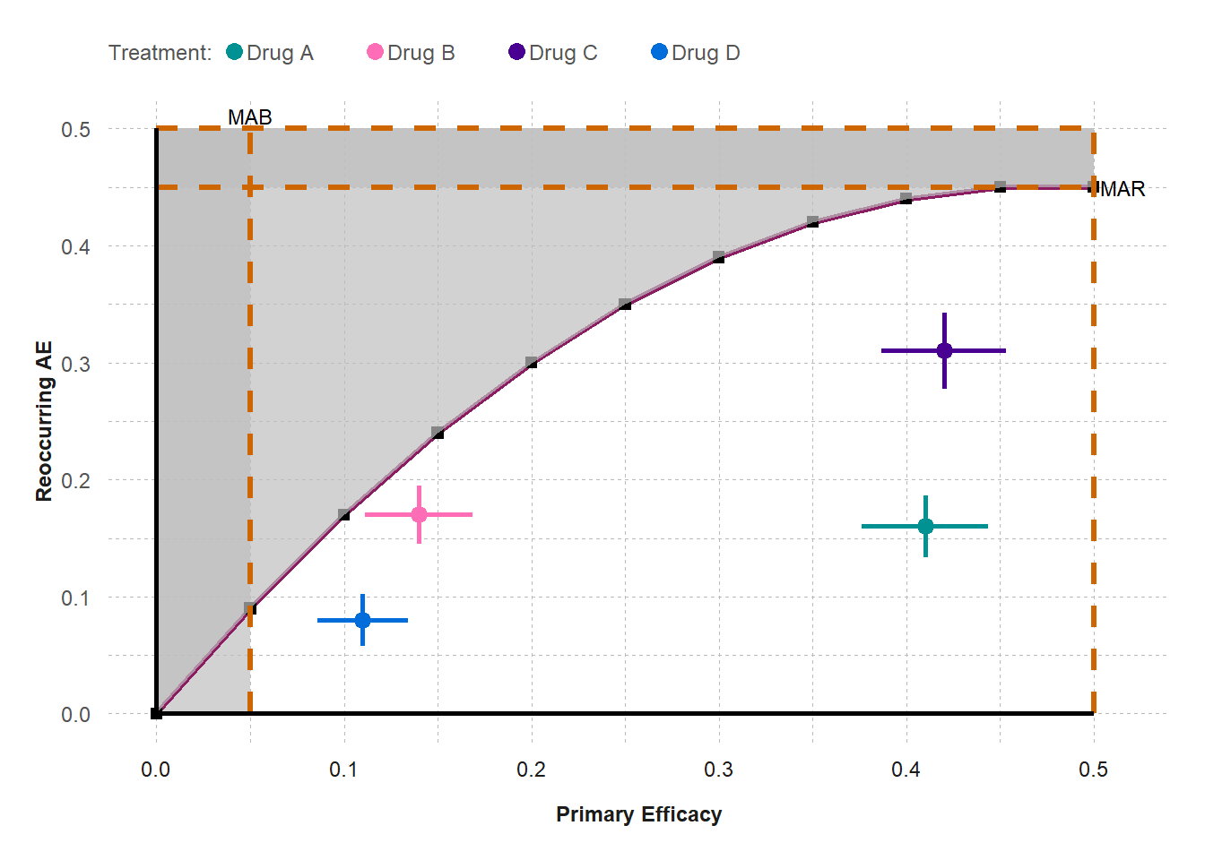
Trade-off Plot
generate_tradeoff_plot(
  data = effects_table, filter = "None", category = "All",
  benefit = "Primary Efficacy", risk = "Reoccurring AE",
  type_risk = "Crude proportions", type_graph = "Absolute risk",
  ci = "Yes", ci_method = "Calculated", cl = 0.95,
  mab = 0.05,
  mar = 0.45,
  threshold = "Segmented line",
  ratio = 4,
  b1 = 0.05,
  b2 = 0.1,
  b3 = 0.15,
  b4 = 0.2,
  b5 = 0.25,
  b6 = 0.3,
  b7 = 0.35,
  b8 = 0.4,
  b9 = 0.45,
  b10 = 0.5,
  r1 = 0.09,
  r2 = 0.17,
  r3 = 0.24,
  r4 = 0.3,
  r5 = 0.35,
  r6 = 0.39,
  r7 = 0.42,
  r8 = 0.44,
  r9 = 0.45,
  r10 = 0.45,
  testdrug = "Yes",
  type_scale = "Free",
  lower_x = 0,
  upper_x = 0.5,
  lower_y = 0,
  upper_y = 0.5,
  chartcolors <- colfun()$fig7_colors
)
How to read
A scatter plot displays the clinical data for one benefit (X-axis) and one risk (Y-axis).
Both benefit and risk can be on different measures, such as proportion, rate, or mean.
For each treatment, the point estimates for benefit and risk are displayed as a single dot at its X-Y coordinate.
The 95% confidence interval for the benefit is horizonal and the 95% confidence interval for the risk is vertical.
Medical judgement is added by assigning thresholds for minimal acceptable benefit (MAB- vertical orange line) and maximum acceptable risk (MAR- orange horizonal line).
The dark gray areas to the right of MAB and above the MAR are designated as unacceptance regions.
A tradeoff threshold curve is created by assigning a risk tolerance to different levels of benefit. These black dots are connected by a solid purple segmented or curved line.
The white area below the threshold or tradeoff curve is the acceptance region.
Key Conclusions:
For this hypothetical tradeoff plot, both the benefit and risk are the difference in proportions between four rival drug and the standard of care.
Since the four drugs were approved by regulators, the tradeoff curve was drawn such that drugs appear in the acceptance region.
The tradeoff curve shows that subjects are willing to accept a higher risk for a higher benefit.
The MAB and MAR could be obtained from the company strategy TPVP document.
Ideally, a drug closest to the lower right corner would be the most favorable option, and drug closest to the upper left corner would be least favorable.
Drug A is more favorable than drugs B and C. There is a tradeoff between Drugs A and D. Severe subjects may prefer Drug A for its higher benefit, and mild subjects may choose drug D for its lower risk.
The plot can display other combinations of one benefit and one risk, as well as for different patient subgroups, dose levels, and studies, in support of the generalizability of the investigational drug.
Ideally, the investigational drug will appear in an area of unmet need in the acceptance region.