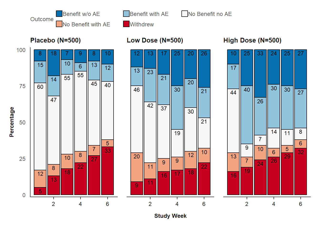
Composite Outcome (Stacked Bar Chart)
stacked_barchart(
  data = comp_outcome,
  chartcolors = colfun()$fig12_colors,
  xlabel = "Study Week"
)
How to read
This visualization is comprised of a separate chart for each dose level placebo, low dose and high dose.
The Y-axis displays the percentage of subjects 0 to 100%.
The X-axis displays the study visits by study week.
Each stacked bar in the display area is comprised of five bars representing the five possible outcomes defined in the legend above the graph.
The five ordinal outcomes range from best scenario (e.g. dark blue = benefit without AE) to worst scenario (e.g., dark red = withdrew).
The outcome category is determined for each subject at each study week. Once subjects withdraw, they continued to be counted in the “Withdrew” category at subsequent visits.
The visualization compares the distribution of the five ordinal outcomes within a visit, across visits, and across doses.
Key Conclusions:
In this hypothetical example, the placebo control group has more subjects with “No Benefit No AE.” The proportion of subjects with benefits is the highest in the high-dose group.
The most favorable outcome of “Benefit-No AE” is not only sustainable but the percentage of subjects is increasing.
It is expected that the percentage of subjects withdrawing increase over time, due to placebo subjects receiving no benefit and other subjects experiencing adverse events.