Disease History (Line Chart)
func <- function(x) 47.982 - 0.0305 * x - 0.57525 * x^2 + 0.0245 * x^3
line_chart(
func = func,
data_bands = data_bands,
data_lines = data_lines,
xmin = 0,
xmax = 14.2,
ymin = 0,
ymax = 50,
xbreaks = seq(0, 14, 2),
ybreaks = seq(0, 50, 5),
xlab = "Years Since Onset",
ylab = "Functional Score",
legend_title = "Severity: "
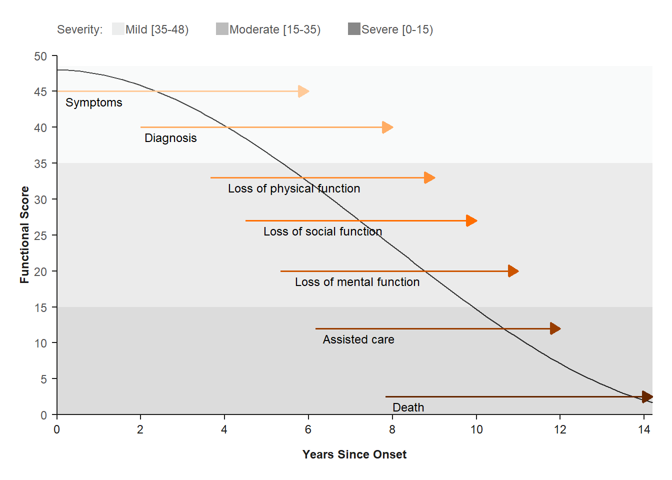
)How to Read
The Y-axis displays the functional score, ranging from 0-50 points on a fictional Quality of Life scale.
The X-axis displays the years since onset of disease, ranging from 0-14 years.
The horizontal bars represent seven disease manifestations (e.g. first symptom, …, death) in the patent population.
The bars span the number of years that a manifestation might appear. For example, death typically occurs between 8 and 14 years since onset of disease.
The bars are color coded according to the three horizonal gray bands of functional scores (mild, moderate or severe) and the legend at the top.
Key Conclusions:
The dark gray curve displays the downward trend in functional score or quality of life over time.
The graph show that the disease manifestations are sequential, hence do not necessarily occur at the same time. Patient follow-up will need to be several years to capture several of the functional domains.
History of disease progression also impacts patient engagement, since newly diagnosed patients might have no experience with more serious manifestations, such as mental function.