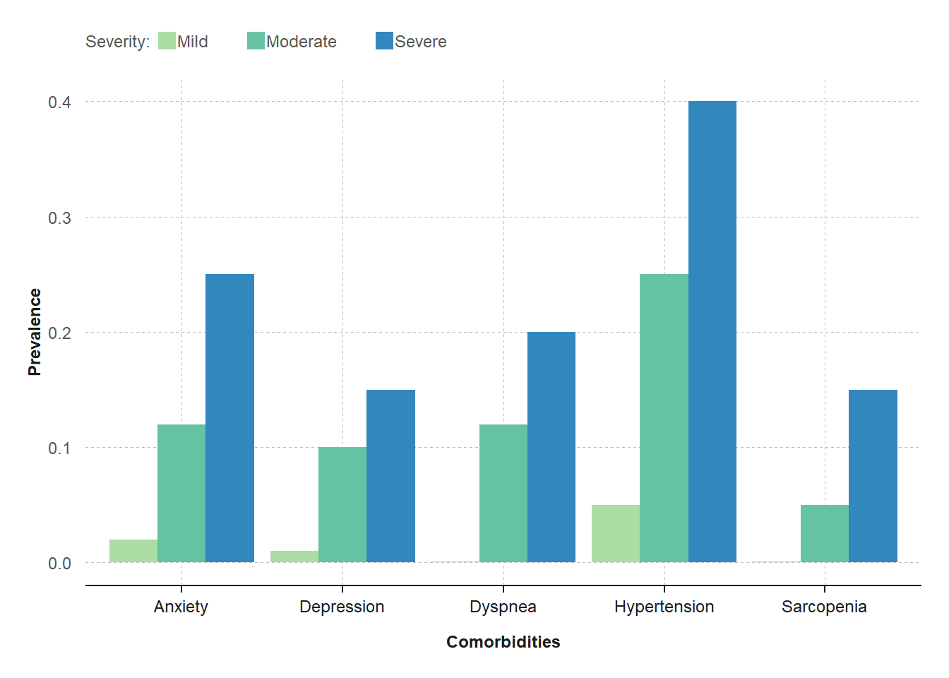
Comorbidities (Grouped Bar Chart)
grouped_barchart(
  data = comorbidities, xvar = "Comorbidities",
  yvar = "Prevalence", groupvar = "Severity",
  chartcolors = colfun()$fig4_colors
)
How to read
The Y-axis displays the prevalence (%) of disease comorbidities in the patient population, ranging from 0 to 40%.
The X-axis displays five comorbidities (anxiety, …, sarcopenia), each categorized by 3 severity levels (mild, moderate, or severe) color coded according to the legend at the top.
Key Conclusions:
The graph displays the background rates of comorbidities, which is useful in designing patient preference studies. For example, patients might place high importance in a drug that reduces severe hypertension.
A display of background rates is also useful in determining whether a comorbidity is likely due to the drug or the disease.