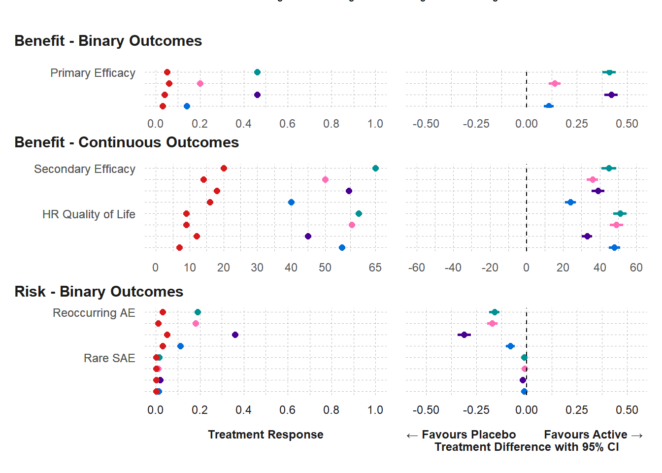
Dot-Forest Plot
forest_dot_plot(effects_table,
  filters = "None",
  category = "All",
  type_graph = "Absolute risk",
  type_risk = "Crude proportions",
  select_nnx = "Y",
  x_scale_fixed_free = "Fixed",
  ci_method = "Calculated",
  exclude_outcome = "Liver"
)
How to read
The two-panel forest plot displays point estimates for each treatment effect on the left side and point estimates (and 95% confidence intervals) for each treatment difference on the right side.
Each color indicates a different treatment (Placebo, Drugs A, B, C, and D), specified in the legend above the plot.
On the Y-axis, there is one row for each outcome’s treatment effects and treatment difference.
Outcomes with different summary statistics (ex. means for continuous data or proportions for binary) are displayed on separate graphs that share a common X-axis.
The X-axis displays the range of values for summary statistics with a vertical reference line at zero for no absolute treatment difference or at one for no relative treatment difference.
Below the X-axis is notation indicating that treatment differences favorable to the active drug appear to the right and differences favorable to placebo appear to the left.
Key Conclusions:
The forest plot gives a visual comparison of all key benefits and key risks simultaneously.
In this example, Drugs A and C have greater efficacy for the primary endpoint, but there are tradeoffs with quality of life and reoccurring AEs.
The hypothetical treatments do not differ on the outcome for the rare SAE, so that outcome might be dropped from the assessment.
The confidence intervals around the treatment differences display their uncertainty or statistical error, indicating possible necessity for a more specific SAE for the hypothetical investigational drug.
The forest plot can be repeated for different patient subgroups, to assess the robustness of the overall assessment.
It is important to not confuse the forest plot with the similar looking meta-analysis plot, which has multiple rows for different studies but for the same endpoint.