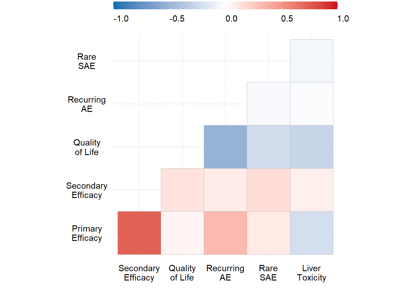
Correlogram
create_correlogram(corr)How to read:
Both the benefit and risk outcomes appear on the X-axis and Y-axis.
The strength of correlation between outcome pair is displayed at their intersection.
Each correlation is color coded according to the legend at the top, ranging from dark blue (-1.0) to dark red (+1.0).
Each correlation along the diagonal is dark red because it’s the correlation of an outcome with itself (i.e. =1.0)
The correlations above the diagonal are blank because they are the mirror image of the correlations below the diagonal.
The underlying correlation coefficients are calculated using formulas specific to the type of data (e.g. binary ordinal, or continuous).
Key Conclusions:
A positive correlation is expected between benefits and expected between risk. A negative correlation might appear between a benefit and risk. This would suggest that subject experiencing the benefit also experience the risk.
As expected, there is a high correlation between the primary and secondary efficacy outcomes. The team might decide to drop the secondary efficacy outcome if there is a concern with double counting.
There is also an explainable negative correlation between outcomes for quality-of-life and recurring AE. The medium positive correlation between recurring AE and primary efficacy is difficult to explain.