The goal of valueJudgementCE is to generate benefit-risk visualizations for the publication “How to visually integrate value judgment with clinical evidence”.
Table of Contents
- Installation
- Figure - Dot-Forest Plot
- Figure - Trade-off Plot
- Figure - Correlogram
- Figure - Scatter Plot
- Figure - Divergent Stacked Bar Chart
- Figure - Cumulative Excess Plot
- Figure - Value Function Types
- Figure - MCDA Comparison Plot
- Figure - MCDA Waterfall Plot
- Figure - MCDA Benefit-Risk Map
- Figure - MCDA Tornado Plot
Installation
You can install the development version of valueJudgementCE from GitHub using the following methods:
Recommended Installation
# Install using pak (recommended)
install.packages("pak")
pak::pak("BR-Visualization/value-judgement-clinical-evidence")
Alternative Installation
# Install using remotes
install.packages("remotes")
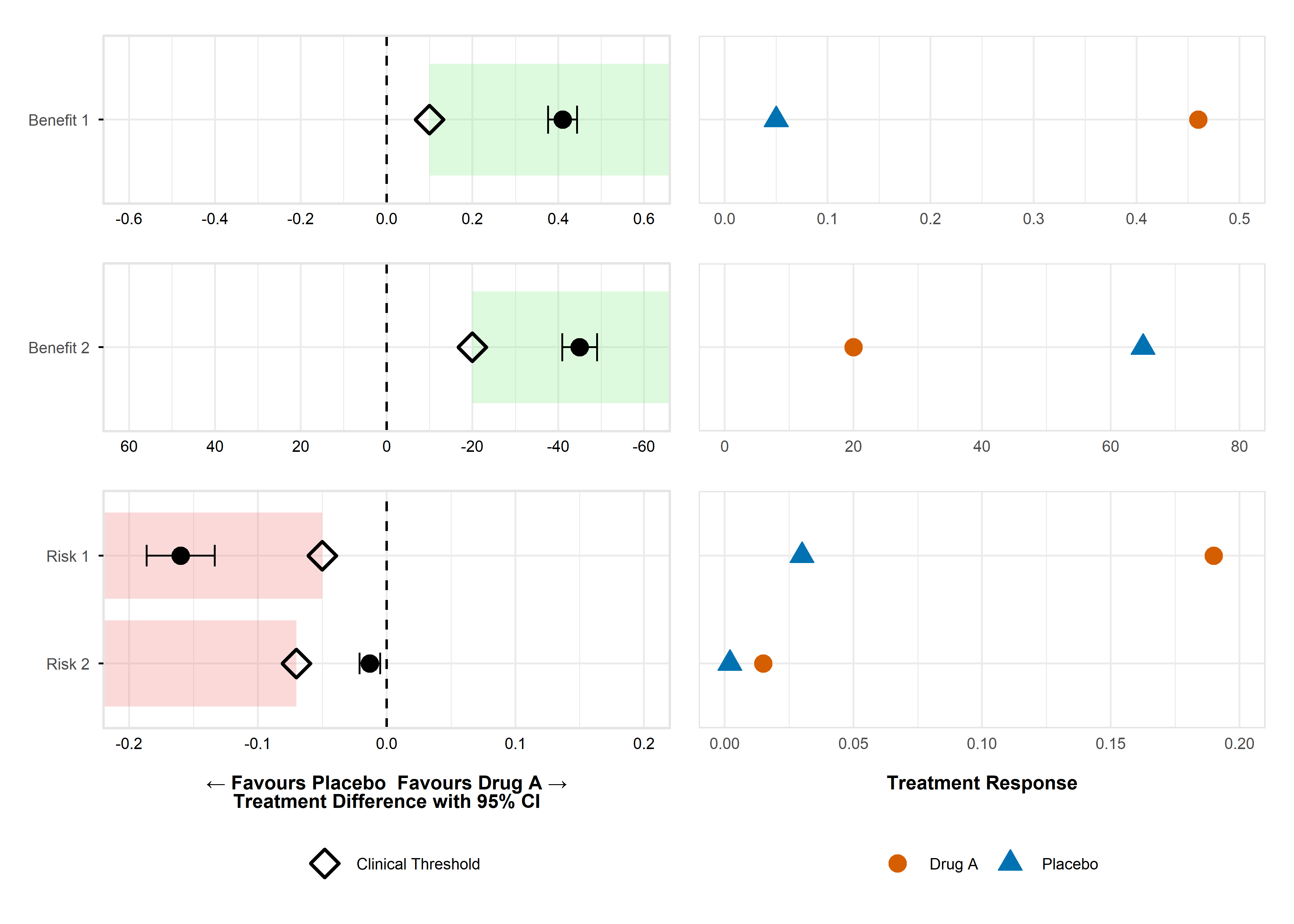
remotes::install_github("BR-Visualization/value-judgement-clinical-evidence")Figure - Dot-Forest Plot
Click to learn more
Getting Help
- Documentation: Use
?create_forest_dot_plotor?prepare_forest_dot_datafor detailed function help - Issues: Report bugs at GitHub Issues
- Discussions: Join discussions at GitHub Discussions
- Contact: Reach out to the package maintainers via GitHub
Click to view sample code
# Load the package and create the plot
library(valueJudgementCE)

# Prepare the data and create the visualization
result_plot <- create_forest_dot_plot(
  prepare_forest_dot_data(effects_table)
)

# Display the plot
result_plot
Figure - Trade-off Plot
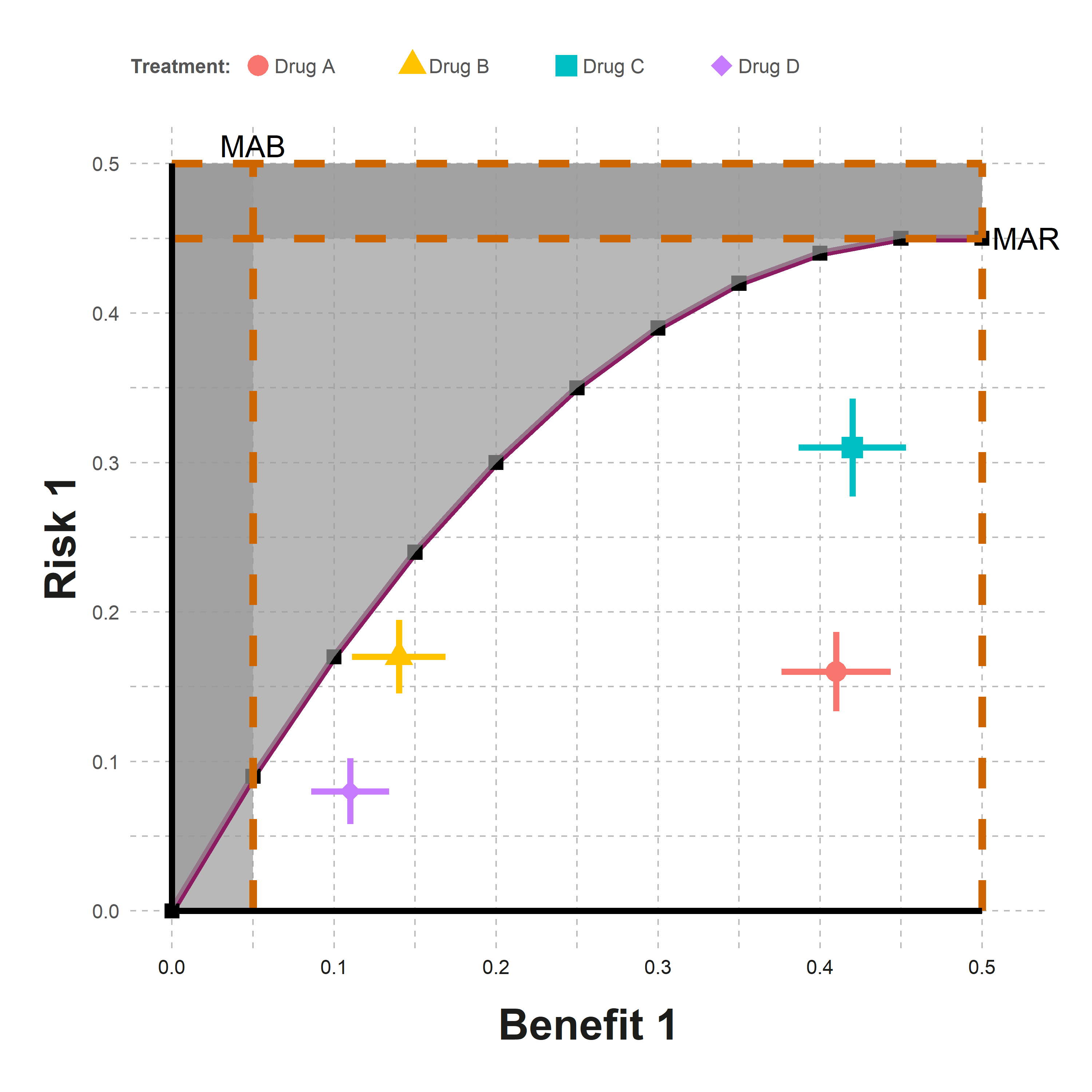
Click to learn more
Getting Help
- Documentation: Use
?generate_tradeoff_plotfor detailed function help - Issues: Report bugs at GitHub Issues
- Discussions: Join discussions at GitHub Discussions
- Contact: Reach out to the package maintainers via GitHub
Click to view sample code
library(valueJudgementCE)

effects_table_filtered <- effects_table |>
  dplyr::filter(Outcome %in% c("Risk 1", "Benefit 1"))

generate_tradeoff_plot(
  data = effects_table_filtered,
  filter = "None",
  category = "All",
  benefit = "Benefit 1",
  risk = "Risk 1",
  type_risk = "Crude proportions",
  type_graph = "Absolute risk",
  ci = "Yes",
  ci_method = "Calculated",
  cl = 0.95,
  mab = 0.05,
  mar = 0.45,
  threshold = "Segmented line",
  ratio = 4,
  b1 = 0.05, b2 = 0.1, b3 = 0.15, b4 = 0.2, b5 = 0.25,
  b6 = 0.3, b7 = 0.35, b8 = 0.4, b9 = 0.45, b10 = 0.5,
  r1 = 0.09, r2 = 0.17, r3 = 0.24, r4 = 0.3, r5 = 0.35,
  r6 = 0.39, r7 = 0.42, r8 = 0.44, r9 = 0.45, r10 = 0.45,
  testdrug = "Yes",
  type_scale = "Free",
  lower_x = 0, upper_x = 0.5,
  lower_y = 0, upper_y = 0.5,
  chartcolors = colfun()$fig7_colors
)
Figure - Correlogram
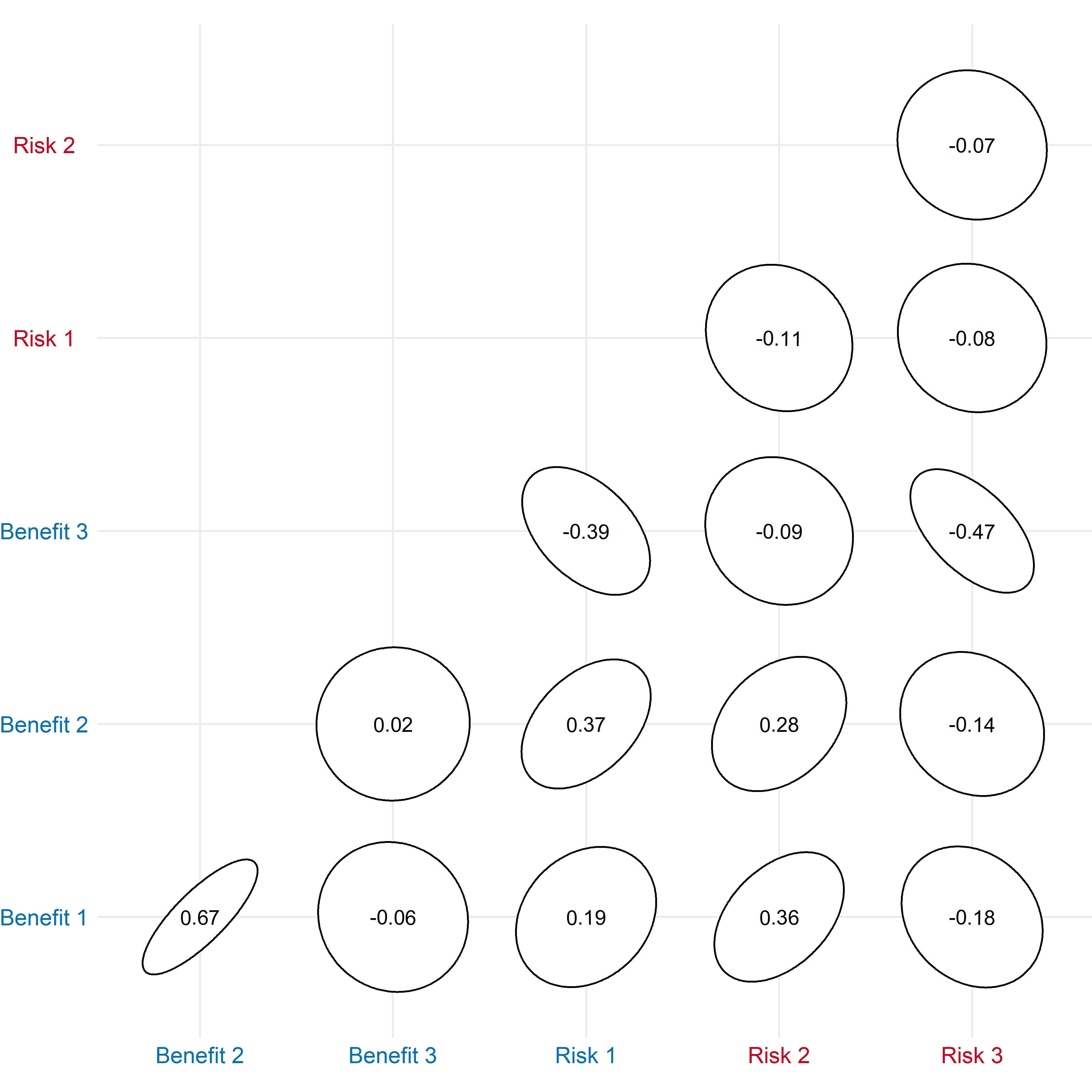
Click to learn more
Getting Help
- Documentation: Use
?create_correlogramfor detailed function help - Issues: Report bugs at GitHub Issues
- Discussions: Join discussions at GitHub Discussions
- Contact: Reach out to the package maintainers via GitHub
Click to view sample code
Figure - Scatter Plot
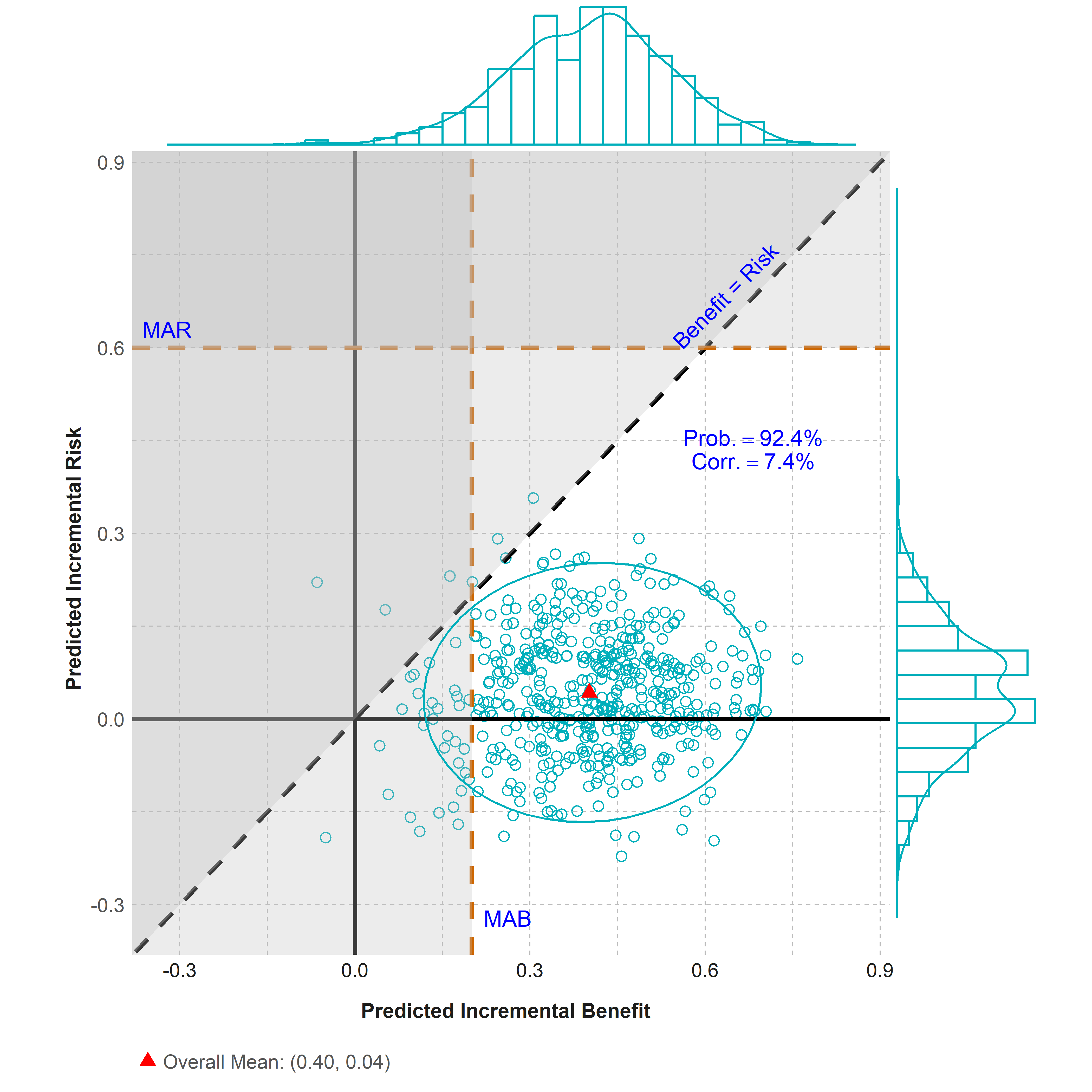
Click to learn more
Getting Help
- Documentation: Use
?scatter_plotfor detailed function help - Issues: Report bugs at GitHub Issues
- Discussions: Join discussions at GitHub Discussions
- Contact: Reach out to the package maintainers via GitHub
Click to view sample code
library(valueJudgementCE)

outcome <- c("Benefit", "Risk")
scatter_plot(scatterplot, outcome, mab = 0.2, mar = 0.6)
Figure - Divergent Stacked Bar Chart
Click to learn more
Getting Help
- Documentation: Use
?divergent_stacked_barchartand?stacked_barchartfor detailed function help - Issues: Report bugs at GitHub Issues
- Discussions: Join discussions at GitHub Discussions
- Contact: Reach out to the package maintainers via GitHub
Click to view sample code
library(valueJudgementCE)
library(cowplot)
library(gtable)

# Create both plots
stacked_bar_fig <- stacked_barchart(
  data = comp_outcome,
  chartcolors = colfun()$fig12_colors,
  ylabel = "Study Week"
)

divergent_stacked_bar_fig <- divergent_stacked_barchart(
  data = comp_outcome,
  chartcolors = colfun()$fig12_colors,
  favcat = c(
    "Benefit larger than threshold, with AE",
    "Benefit larger than threshold, w/o AE"
  ),
  unfavcat = c(
    "Withdrew",
    "Benefit less than threshold, w/o AE",
    "Benefit less than threshold, with AE"
  ),
  ylabel = "Study Week"
)

# Extract and combine with shared legend
stacked_bar_with_legend <- stacked_bar_fig +
  labs(fill = "Outcome") +
  theme(legend.position = "top",
        legend.justification = "center",
        legend.box.just = "center",
        legend.title.align = 0.5) +
  guides(fill = guide_legend(nrow = 2, title.position = "top", title.hjust = 0.5))

g <- ggplotGrob(stacked_bar_with_legend)
legend <- g$grobs[[which(g$layout$name == "guide-box-top")]]

stacked_bar_no_legend <- stacked_bar_fig +
  theme(
    legend.position = "none",
    plot.background = element_rect(color = "black", fill = NA, linewidth = 0.5)
  )
divergent_stacked_bar_no_legend <- divergent_stacked_bar_fig +
  theme(
    legend.position = "none",
    plot.background = element_rect(color = "black", fill = NA, linewidth = 0.5)
  )

combined_plots <- plot_grid(stacked_bar_no_legend, divergent_stacked_bar_no_legend, ncol = 2)
plot_grid(legend, combined_plots, ncol = 1, rel_heights = c(0.2, 1))
Figure - Cumulative Excess Plot
Click to learn more
Getting Help
- Documentation: Use
?gensurv_combinedfor detailed function help - Issues: Report bugs at GitHub Issues
- Discussions: Join discussions at GitHub Discussions
- Contact: Reach out to the package maintainers via GitHub
Click to view sample code
library(valueJudgementCE)

gensurv_combined(
  df_plot = cumexcess, subjects_pt = 100, visits_pt = 6,
  df_table = cumexcess, fig_colors_pt = colfun()$fig13_colors,
  rel_heights_table = c(1, 0.5),
  legend_position_p = c(.1, 1.56),
  titlename =
    "Cumulative Excess # of Subjects w/ Events (per 100 Subjects)",
  mar = 32,
  mab = 15,
  mcd = 22
)
Figure - Value Function Types
Click to learn more
Getting Help
- Documentation: Use
?compare_value_function_typesfor detailed function help - Issues: Report bugs at GitHub Issues
- Discussions: Join discussions at GitHub Discussions
- Contact: Reach out to the package maintainers via GitHub
Click to view sample code
library(valueJudgementCE)

compare_value_function_types(
  benefit_name = "Efficacy",
  benefit_min = 0,
  benefit_max = 100,
  benefit_label = "Response Rate (%)",
  risk_name = "Safety",
  risk_min = 0,
  risk_max = 100,
  risk_label = "Adverse Event Rate (%)",
  power = 2,
  show_titles = FALSE,
  show_legend = TRUE
)
Figure - MCDA Comparison Plot
Click to learn more
Getting Help
- Documentation: Use
?create_mcda_barplot_comparisonfor detailed function help - Issues: Report bugs at GitHub Issues
- Discussions: Join discussions at GitHub Discussions
- Contact: Reach out to the package maintainers via GitHub
Click to view sample code
library(valueJudgementCE)

create_mcda_barplot_comparison(
  data = mcda_data,
  study = "Study 1",
  benefit_criteria = c("Benefit 1", "Benefit 2", "Benefit 3"),
  risk_criteria = c("Risk 1", "Risk 2"),
  comparison_drug = "Drug A",
  clinical_scales = clinical_scales,
  weights = weights
)
Figure - MCDA Waterfall Plot
Click to learn more
Getting Help
- Documentation: Use
?create_mcda_waterfallfor detailed function help - Issues: Report bugs at GitHub Issues
- Discussions: Join discussions at GitHub Discussions
- Contact: Reach out to the package maintainers via GitHub
Click to view sample code
library(valueJudgementCE)

create_mcda_waterfall(
  data = mcda_data,
  comparator_name = "Placebo",
  benefit_criteria = c("Benefit 1", "Benefit 2", "Benefit 3"),
  risk_criteria = c("Risk 1", "Risk 2"),
  weights = weights,
  clinical_scales = clinical_scales
)
Figure - MCDA Benefit-Risk Map
Click to learn more
Getting Help
- Documentation: Use
?create_mcda_brmapfor detailed function help - Issues: Report bugs at GitHub Issues
- Discussions: Join discussions at GitHub Discussions
- Contact: Reach out to the package maintainers via GitHub
Click to view sample code
library(valueJudgementCE)

create_mcda_brmap(
  data = mcda_data,
  comparator_name = "Placebo",
  benefit_criteria = c("Benefit 1", "Benefit 2", "Benefit 3"),
  risk_criteria = c("Risk 1", "Risk 2"),
  weights = weights,
  clinical_scales = clinical_scales,
  show_frontier = TRUE,
  show_labels = TRUE
)
Figure - MCDA Tornado Plot
Click to learn more
Getting Help
- Documentation: Use
?mcda_tornadofor detailed function help - Issues: Report bugs at GitHub Issues
- Discussions: Join discussions at GitHub Discussions
- Contact: Reach out to the package maintainers via GitHub
Click to view sample code
library(valueJudgementCE)

mcda_tornado(
  data = mcda_data |> dplyr::filter(Study == "Study 1") |> dplyr::select(-Study),
  comparator_name = "Placebo",
  comparison_drug = "Drug A",
  weights = weights,
  clinical_scales = clinical_scales
)License
This package is licensed under the MIT License. See the LICENSE file for details.
Built with ❤️ for the benefit-risk visualization community