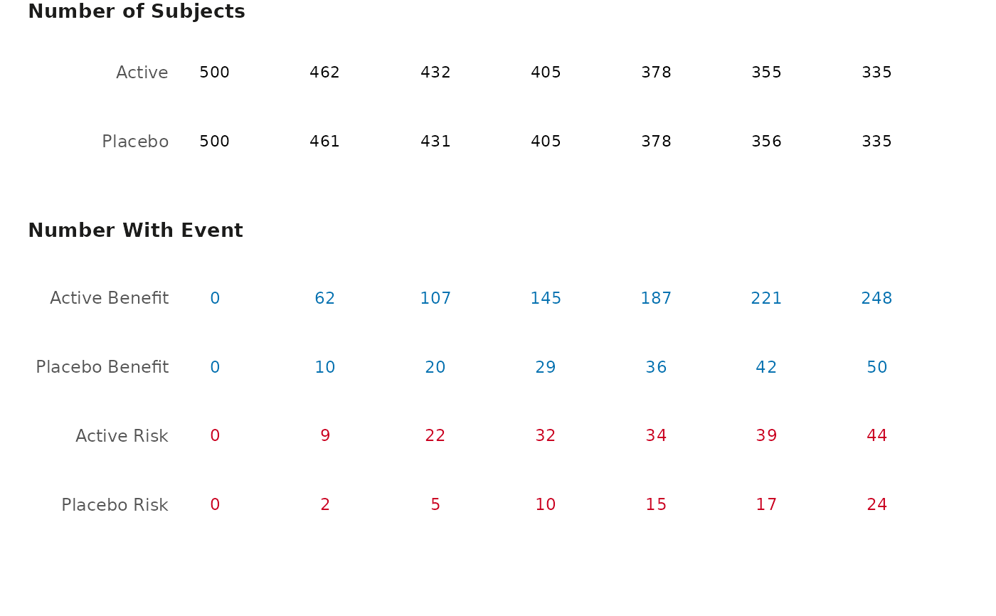
Create a table that corresponds to the cumulative excess plot
gensurv_table.RdCreate a table that corresponds to the cumulative excess plot
Usage
gensurv_table(
  df_table,
  base_subjects,
  visits,
  fig_colors = c("#0571b0", "#ca0020"),
  base_font_size = 9
)
Arguments
- df_table
A dataframe with 6 variables named the following:
obsv_duration: A variable that specifies the duration of the observational period (numerical).
n: A vector containing a number of subjects who experienced an event at a given time (numerical).
effect: specifies between an active or control effect.
outcome: specifies whether the an outcome should be classified as a "Benefit" or "Risk" (this must have either "Benefit" or "Risk" as values).
eff_code: 0 for control and 1 for active effect.
subjects: A vector containing the total number of active/placebo subjects in the study at a given time.
- base_subjects
A numerical input that specifies the baseline proportion of subjects in the study (for example, "per 100 subjects")
- visits
A numerical input that is the length between observational periods.
- fig_colors
Allows the user to change the colors of the table (defaults are provided). Must be vector of length 2, with color corresponding to benefit second and risk first.
- base_font_size
Numeric; base font size in points for all text elements in the plot (default: 9).