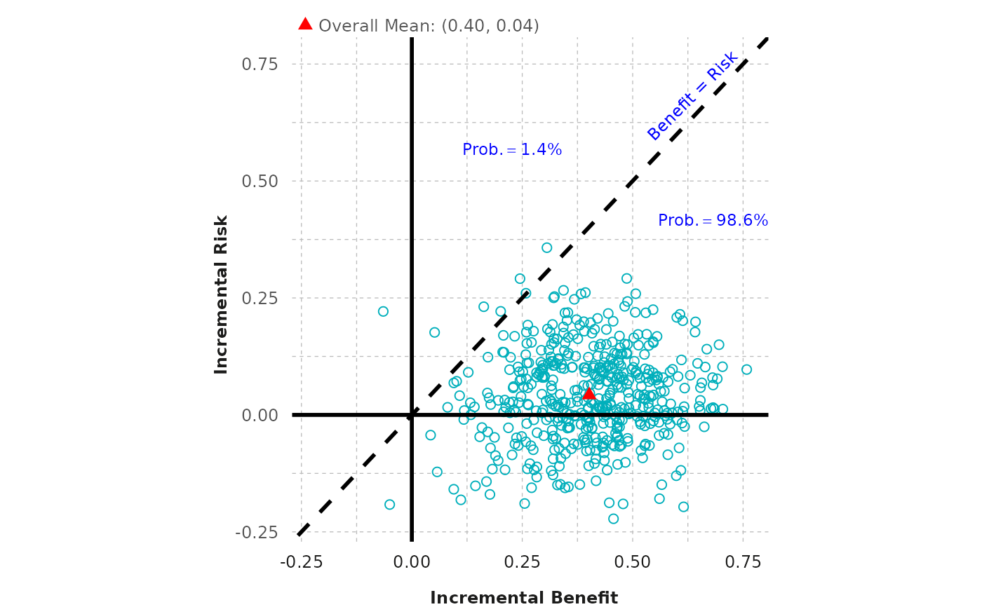
Create a scatterplot from a given dataframe.
Arguments
- df_diff
A dataframe containing two vectors, each of which displays the difference between incremental probabilities in active and control effects for a specified outcome.
- outcome
A vector of two strings that describes the two outcomes associated with the difference in active and control effects, where the first outcome corresponds to
diff1and the second todiff2.- legend_position
Allows user to specify legend position. Must be a vector of length 2, with the first numeric value corresponding to the position of the legend relative to the x-axis, and the second numeric value corresponding to the position of the legend relative to the y-axis (defaults are given).
- fig_colors
Allows user to change colors of the figure (defaults are provided). Must be a vector of length 3, with the first color corresponding to the scatter plot points, the second corresponding to the overall mean, and third to the written probability text color.
Value
A scatterplot.
Examples
outcome <- c("Benefit", "Risk")
scatter_plot(scatterplot, outcome)