Creates a population pyramid chart to visualize the distribution of a demographic variable (e.g., prevalence) across age groups and genders (or other binary groups).
pyramid_chart(
  data,
  xvar,
  yvar,
  levelvar,
  groupvar,
  xlab,
  alpha_set,
  chartcolors
)
Arguments
- data
dataframe A data frame containing at least four columns: x-axis variable, y-axis variable, and two grouping variables.
- xvar
string The column name in data representing the numeric values to be plotted on the x-axis, i.e., the lengths of the bars (e.g., "Prevalence" or a transformed version of it). This variable must be a numeric vector.
- yvar
string The column name in data representing the categories to be plotted on the y-axis, i.e., the names of the bars (e.g., "Age"). This variable must be a factor, character, or numeric vector.
- levelvar
string The column name in data representing the grouping variable to create separate pyramids (e.g., "Type"). This grouping variable must be a factor, character, or numeric vector.
- groupvar
string The column name in data representing the binary groups to be displayed on each side of the pyramid (e.g., "Gender"). This grouping variable must be a factor, character, or numeric vector with two levels.
- xlab
string Label for the x-axis.
- alpha_set
numeric Specify the transparency of the bars in the chart (between 0 and 1).
- chartcolors
vector A vector of two colors to be used for the two sides of the pyramid.
Value
A ggplot object representing the population pyramid chart.
Examples
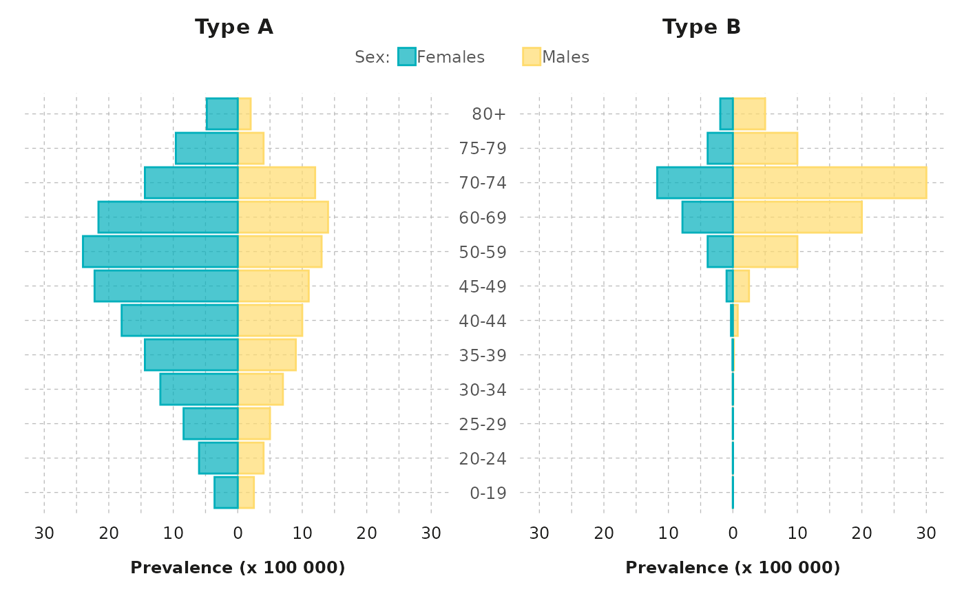
# Assuming 'demography' is your data frame
demography |>
  dplyr::mutate(
    Type = as.factor(paste0("Type ", Type)), # Create a factor for separate pyramids
    figprev = ifelse(
      Gender == "Females", -1 * Prevalence / 100000, Prevalence / 100000
    ), # Transform prevalence for females to negative values
    Sex = Gender # Rename "Gender" to "Sex" for the plot
  ) |>
  pyramid_chart(
    levelvar = "Type", xvar = "figprev", yvar = "Age",
    groupvar = "Sex", alpha_set = 0.7, chartcolors = colfun()$fig2_colors,
    xlab = "Prevalence (x 100 000)"
  )