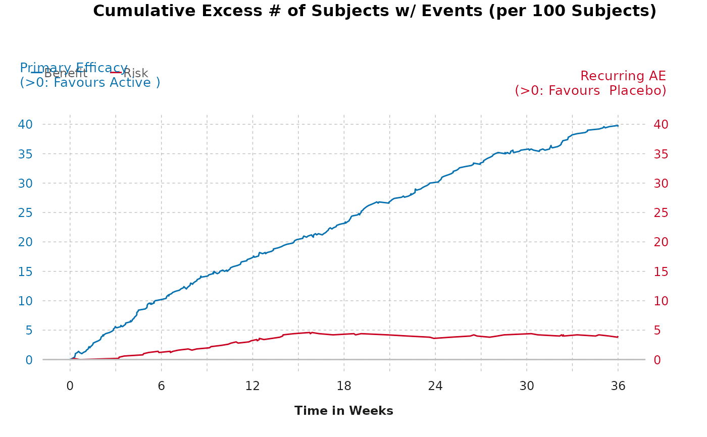
Create a cumulative excess plot from a given dataframe
gensurv_plot.RdCreate a cumulative excess plot from a given dataframe
Arguments
- df_outcome
A dataframe with 6 variables named the following:
eventtime: A vector of time points at which an event occurred.
diff: A vector containing the difference in active and control effects.
obsv_duration: A variable that specifies the duration of the observational period (numerical).
obsv_unit: A variable that specifies the unit for the duration of the observational period (this is a non-numerical input).
outcome: A vector containing whether the outcome is a "Benefit" or "Risk".
eff_diff_lbl: A vector containing the label for effect difference.
- subjects
A numerical input that specifies the baseline proportion of subjects in the study (for example, "per 100 subjects")
- visits
A numerical input that is the length between normal visits.
- fig_colors
Allows the user to change the colors of the figure (defaults are provided). Must be vector of length 2, with color corresponding to benefit first and risk second.
- titlename
Allows the user to change the documentation of the title (default is provided).
- ben_name
Allows user to specify benefit of interest (default is provided).
- risk_name
Allows user to specify risk of interest (default is provided).
- legend_position
Allows user to specify legend position. Must be a vector of length 2, with the first value corresponding to the position of the legend relative to the x-axis, and the second corresponding to the position of the legend relative to the y-axis (numeric).
Value
A cumulative excess plot.
Examples
gensurv_plot(cumexcess, 100, 6,
  titlename =
    "Cumulative Excess # of Subjects w/ Events (per 100 Subjects)"
)